The world's most underserved
writing system.
Six million speakers. Fifteen centuries of literary tradition. A diaspora scattered across forty countries.
And fewer than a dozen usable digital typefaces — none of them designed for children, learners, or the modern web.
We are building the fonts that don't exist yet.
A crisis hiding in plain sight.
Latin script has thousands of typeface families. Tibetan has perhaps fifteen digital fonts of acceptable quality. Of those, not one was designed with a child, a heritage learner, or a mobile developer in mind.
Children learn with the wrong tools
Tibetan school textbooks use fonts designed for monks and scholars — dense, intricate, unforgiving. A child encountering the script for the first time faces a wall of complexity that students of Latin or Cyrillic will never experience. The font itself becomes a barrier to literacy.
The diaspora is losing the script
Second and third-generation Tibetan exiles speak the language fluently but cannot read or write it. When we asked why, we heard the same answer again and again: "The writing looked too hard. The letters were too complicated. I gave up." The problem is not ability — it's the fonts.
Developers have nowhere to turn
A developer building a Tibetan education app has one real option for a body font, and zero options for a sans-serif that renders cleanly at small sizes on screen. So Tibetan apps don't get built. Tibetan content stays off the platforms where the next generation actually lives.
Existing fonts were not designed — they were digitised
Most available Tibetan fonts are digital tracings of hand-drawn letterforms from the 1990s. They were never designed for screen rendering, variable weight, or multilingual typesetting. They clip at small sizes, break on mobile, and sit poorly alongside Latin text. They were good enough for the era they came from. That era is over.
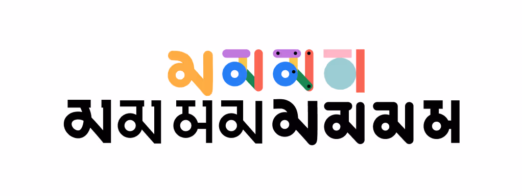
Three fonts.
Three audiences no one else is serving.
Each typeface is being developed from original calligraphic drawings with master calligrapher Jamyang Dorjee, then refined for digital use by type designers fluent in both Tibetan script tradition and modern font technology.
Terma Serif
A refined serif typeface that honours Uchen calligraphic tradition while meeting the demands of modern print — consistent weight, precise hinting, reliable line-height, full Unicode coverage. The scholarly font Tibetan publishing has needed for a generation.
Terma Sans
The typeface the digital world has been waiting for. A clean, screen-optimised sans-serif that works at every scale — navigation labels, headlines, body text — and sits naturally alongside Latin, Chinese, and Devanagari in multilingual products.
Terma Lotsawa
The font nobody has built yet. Simplified letterforms, generous spacing, and friendlier proportions that make Tibetan script approachable instead of intimidating. Designed alongside educators and diaspora Tibetans who told us the same story: "I gave up because the writing looked too hard."
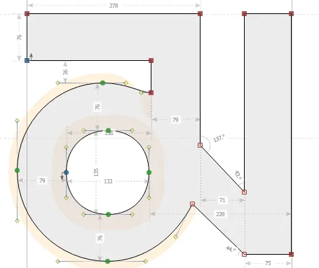
A single letter,
hundreds of decisions.
Every curve, weight, and angle is deliberate. This is what font design actually looks like — a single Tibetan character, traced from calligraphic drawings and refined digitally by hand, point by point, until it renders clearly at every size on every screen.
Each of the hundreds of characters in a Tibetan typeface requires this level of care. That is what your support makes possible.
Made with master
calligraphers, not algorithms.
Terma Foundry was founded by Thupten Chakrishar — a technologist who started this project six years ago wanting his children to love their language, and found the fonts to do that simply didn't exist.
At the calligraphic core is his father, Jamyang Dorjee — a renowned master whose decades of practice carry deep cultural wisdom and meticulous craftsmanship. Alongside him, Tibetan linguists and educators review every design decision against the lived reality of teaching and learning the script today — ensuring each font actually serves the people who need it most.
Completing the foundry are the specialists that turning calligraphy into a working typeface demands: type designers who translate hand-drawn letterforms into precise digital outlines, font engineers who build the technical features that make a font render correctly at every size on every platform, and script specialists who ensure every character is covered and works everywhere it needs to.
When these fonts exist,
everything becomes possible.
Children read with fonts made for them
Tibetan school textbooks, storybooks, and digital learning tools built with letterforms a child can actually befriend.
Diaspora learners don't give up
Heritage language programmes, Tibetan apps, and community materials that feel welcoming instead of forbidding.
Tibetan belongs on every screen
Developers can build the apps that don't exist. Tibetan text on phones, operating systems, and interfaces — actually looking right.
Free forever
Every font we produce is released under an open-source license — free to use, modify, and redistribute, for every person and institution on earth, permanently.
"We envision a world where Tibetan script isn't just preserved — it thrives. Where Tibetan appears boldly on book covers, video game screens, and classroom whiteboards."— Terma Foundry Mission Statement
Help us finish what we've started.
Creating original Tibetan typefaces is painstaking work. A single font family takes 12–18 months of calligraphic drawing, digitisation, hinting, and testing. We are committed to releasing all three fonts freely — but we need resources to get there.
What your support enables
- Calligrapher studio time and character drawing sessions
- Font engineering: turning hand-drawn letters into working digital fonts
- Testing across platforms: Windows, macOS, iOS, Android, web browsers
- Ensuring every character works correctly in every application
- Long-term hosting and open-source maintenance — forever
Grant enquiries welcome. We are happy to provide detailed project documentation, timelines, and budgets for institutional funders. Read the full technical proposal (for specialists) → · termastudios@gmail.com